
With thanks to our friends at Neave Creative, we have a fantastic newly updated logo. We love it and would love to hear what you think! While going through this process, we had a few thoughts about why we wanted to update our logo and why a brilliant logo is so important for successful business.
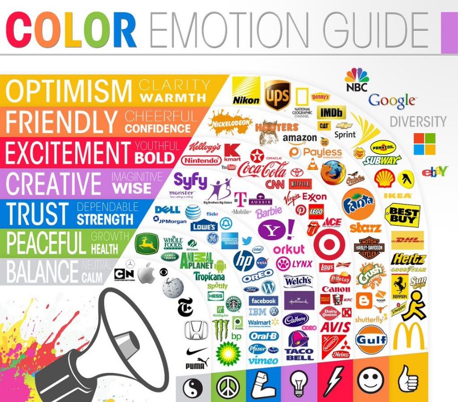
Colours - What do they mean?
At Daniel Bullock Photography we love the colour orange! It's eye-catching, energetic, fun, warm and happy.
Some of you may have seen this image before, which we thought was really interesting. Each colour represents something. What is your favourite colour and why? If you have a business, what are your theme colours and do these descriptions match some of your key values?
Logo Development
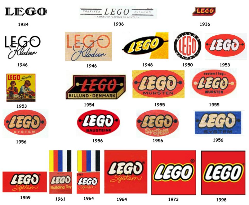
We also had a look at some examples of how other well known logos have changed and developed through the years, right before our eyes! But did we notice? How do the logos change our way of thinking? What makes them so recognisable?
![]()
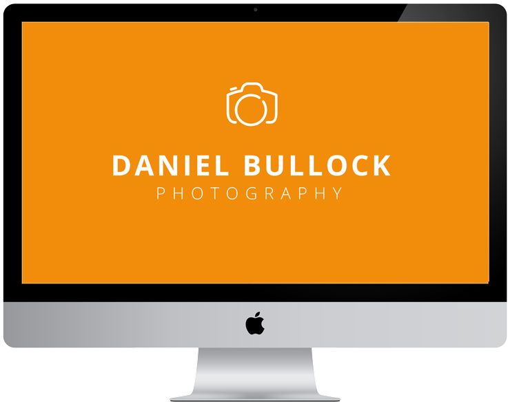
Our New Logo
We feel that our new Daniel Bullock Photography logo truly represents what we are all about - a fun, energetic, friendly business with a passion for capturing moments which are truly worth remembering for years to come!
Our bold orange colour is memorable and recognisable, and the unique design really makes us stand out from the crowd. And of course, consistency is key which is why we have also updated the icon for our social media accounts to match.
Thanks Neave Creative!
 loading...